Milton Academy | Branding Sports
Uniform uniforms
With 30 interscholastic and 9 intramural teams, 12 fields, 4 athletic buildings and 17 tennis courts, its obvious that sports has always been a major focus at this prestigious New England college preparatory school. However, it wasn’t until recently that they focused on the need for a single, strong athletic brand for the school’s presence on and off the field.
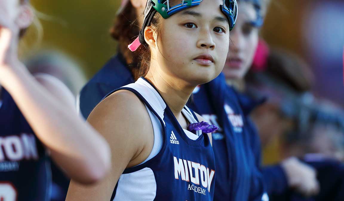
Thirty years ago a student vote triggered the adoption of the mustang as Milton Academy’s mascot. But its implementation process was informal, organic and inconsistent, resulting in varied depictions across – and even within – individual sports teams. They recruited Bernhardt Fudyma to bring branding consistency to their team sports uniforms, student apparel and other school ephemera.
The design includes numerous options for implementing a graphic treatment, and at the same time ensures that Milton has a consistent look. The set of designs available for teams includes the Milton “M,” used at Milton Academy since 1886. The Milton “M” came to be affectionately known as the “Stoky M,” in honor of Herbert G. Stokinger ’24, beloved director of athletics and physical education for over 40 years.
SERVICES PROVIDED
Logo and Typography Design, Branding System and Application, and Sports Branding Guidelines
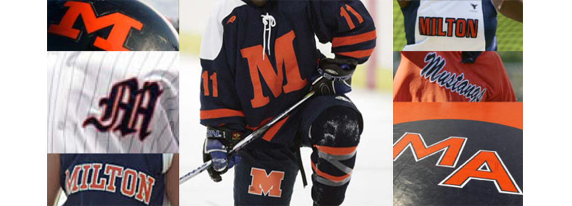
CONTEXT. Other than the school’s colors of orange and blue, no consistent usage of the school’s name, initials or the mustang mascot existed on any of its team uniforms, student apparel or athletic venues. During our discovery phase we uncovered no less than 30 disparate applications of fonts, orientations and combinations of the various brand elements.

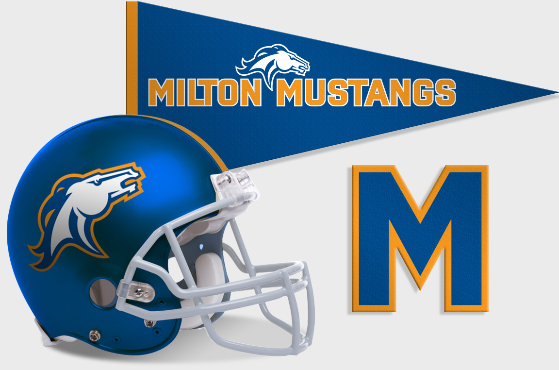
TYPOGRAPHY. A sans serif capital ‘M’ used by Milton since 1886 became the touchstone for our design exploration of letterforms and wordmarks for the new identity.
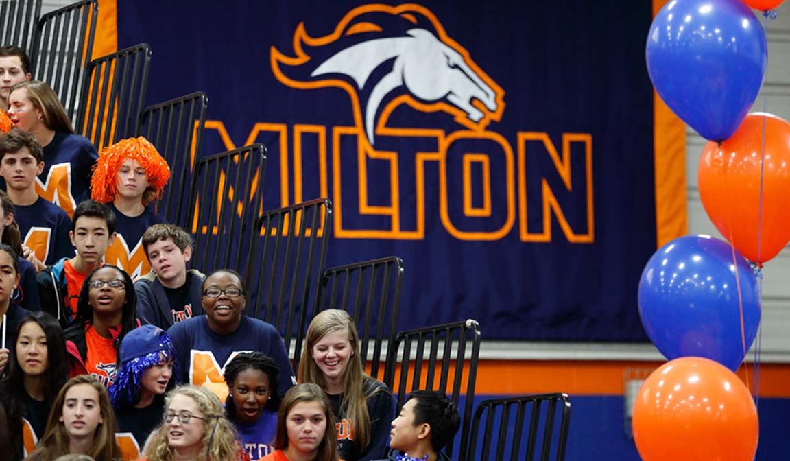
LOGO. We created a unique Mustang logo that could be used alone or in combination with the other brand wordmarks.
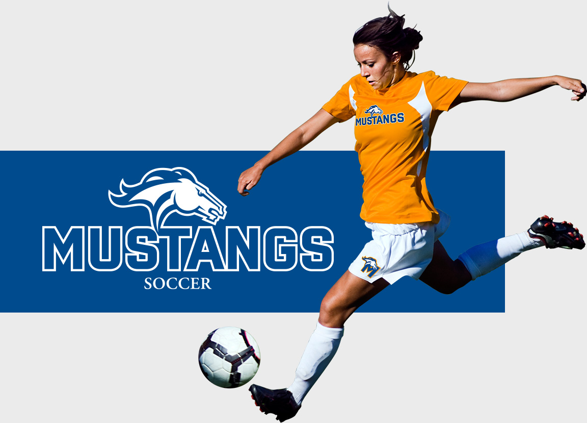
BRANDING SYSTEM. A complement of core identifiers which could be used in combination with subordinate wording and interchangeable color combinations was created to accommodate all potential applications of the new branding.
BRANDING APPLICATION. With the new branding, students, faculty, parents and alumni can show their spirit and pride in Milton, whether they are in uniform or simply wearing Milton gear.
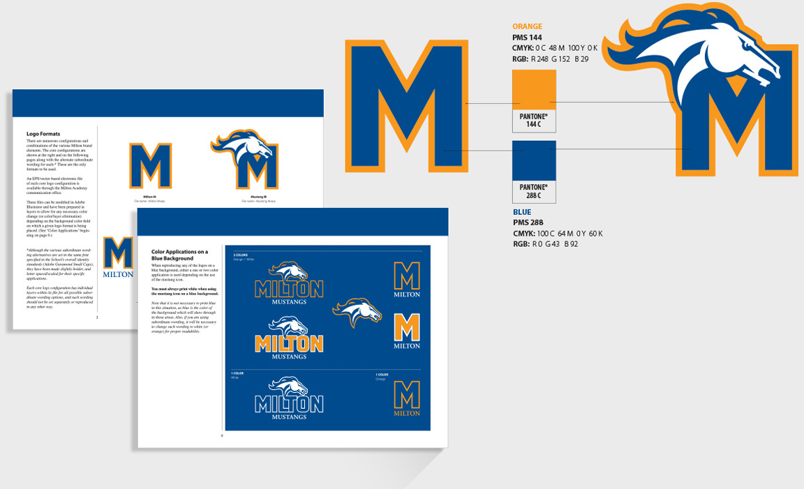
BRANDING GUIDELINES. We also produced implementation guidelines and provided all necessary master eps files to enable the ongoing consistent application of the new branding by the school and its outside consultants and suppliers.
The Result
We enlisted Bernhardt Fudyma to help us develop a strong and consistent graphic brand identity for our athletic program, the results of which are visually appealing in all applications. They expertly developed a look and feel that is both contemporary and nods to our School’s traditional and treasured sans serif M. We are pleased with both the results—including a comprehensive and accessible set of implementation guidelines—and the easy and enjoyable process in working with them. I have recommended Bernhardt Fudyma to communication directors at other schools, and I will do so again. / Director of Communication, Milton Academy


