Type specification in the days before ‘command A’.
With the remarkable text formatting capabilities of today’s page composition applications such as InDesign and QuarkXpress, very few designers born in the last 40 years can relate to the low tech process that was once needed to determine how much space the copy in a brochure, ad or book would consume when set in a certain font at a particular point size.
Using our computers we can not only effortlessly change point size and leading in fractions of a point, but also track and kern letter or word spacing in thousandths of an em and even condense the width of a font (or individual character) by any percentage we choose. With so many ways to manipulate the characteristics of the type, and instantly see the results, it’s hard to imagine the calculations and time demands that were required to accomplish something as simple as changing the width of a text column – let alone the font, point size or leading in a paragraph – when the typesetting process involved atoms rather than bits. Just 40 years ago, pages of words were composed nearly the same way they were 5 centuries ago….by manually assembling each word, sentence and paragraph with individual pieces for each letter, space and punctuation mark. Practically all text composition was derived from Gutenberg’s movable-type printing press, often regarded as the single most important invention of the second millennium.
The process was improved in the late 1800s by Ottmar Mergenthaler who invented the Linotype machine that could produce an entire line of metal type at once – hence a line-o’-type. The Linotype machine revolutionized newspaper publishing, making it possible for a small number of operators to set type for many pages on a daily basis. Before 1884, no newspaper in the world had more than eight pages.
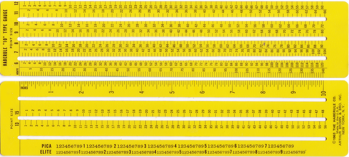
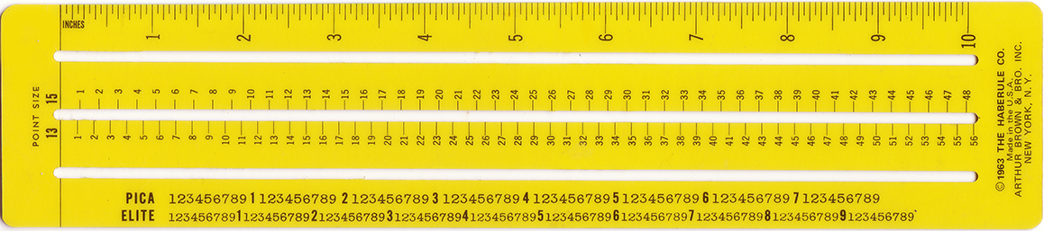
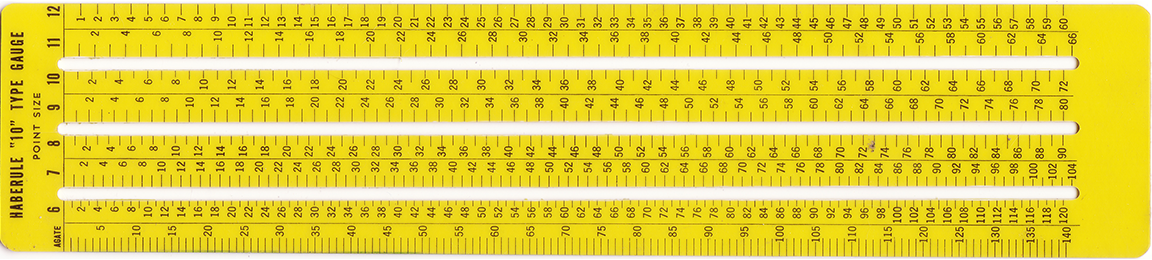
But, back to our strange tool – the Haberule. Manufactured by The Haberule Co. in Wilton, CT., it was used in conjunction with that archaic pre-computer discipline commonly referred to as ‘type specing’…..a process which consisted of a number of steps and mathematical calculations.
Imagine you’ve gone through a time warp – or your computer has just fried – here’s what you would do:
1. Determine the amount of copy to be set
By using the elite or pica scales on the left edge of the Haberule determine the number of characters – and spaces – in an average line of the client’s typewritten manuscript. (Elite and Pica being the two styles of type on typewriters of the day.) Then multiply that number by the number of lines in the entire manuscript – whether 1 page or 100 – to get the total number of characters.
Back then, each type foundry’s font catalogue provided a CPI number (characters per inch) which let you calculate how many characters of a particular font at a given point size would fit on a single line of text within your column width. (By the way, there were no practical pocket electronic calculators 4 decades ago to do the math for you.)
2. Calculate the number of typeset lines
Knowing the number of typeset characters per line, based on the CPI of your particular font and point size, divide that number into the total number of characters in the entire manuscript to determine how many lines the copy would run when set.
3. Find the depth of the typeset copy
Once you know the number of lines that your copy will run, use the scale on the type gauge that corresponds to the point size of the font you are using (including leading*) to see the depth to which that number of typeset lines will fall.
If you discover that the point size of the font with which you just performed your calculations runs too long, go back and either increase your column width, decrease your point size or choose a different font altogether – or some combination of the three. Any of these modifications require starting over using the CPI for the new font/point size and using a different scale on the Haberule. This may take multiple attempts until you get the right combination of typeface, point size, leading and column width that will accommodate all of the copy within the space available.
* If you were specing 10 point text on 2 points of leading (a term still in use from the centuries before the computer eliminated the need for those actual lead line spacers) you would use the 12 point scale.
4. Mark-up the manuscript
When you’ve determined the right combination of specs, you must annotate the typewritten manuscript, describing in detail the various specs for headlines, body copy, captions and column widths – particularly tricky when your column changes widths after a certain number of lines to accommodate an image or other graphic.
5. Have the copy typeset
Finally, send the marked-up manuscript to the typesetter who, following your specs, will compose the text into galley proofs. This will take a day or more depending on the volume of text. (If the client makes subsequent copy edits, they must also be written out on the galleys and sent back for resetting, perhaps multiple times.)
Today, what can be done in a matter of hours with our computers used to take days, and many dollars, in the days of the Haberule.
Now that you consider yourself lucky to have been born after 1970, you might enjoy a look at many other interesting – and obsolete – designer tools and techniques at the online ‘Museum of Forgotten Art Supplies’ founded and curated by Lou Brooks.