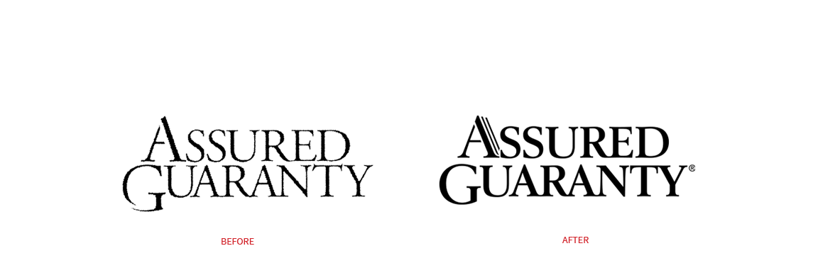
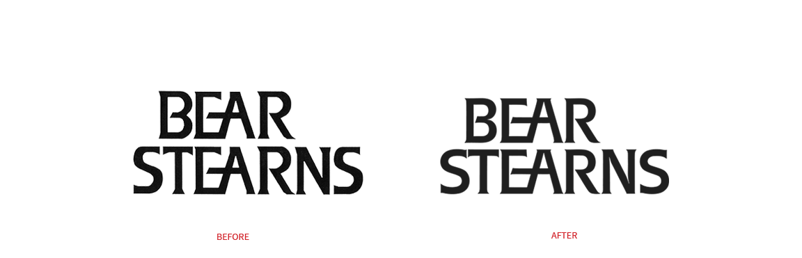
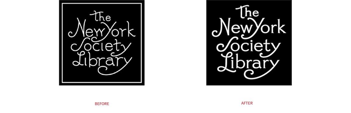
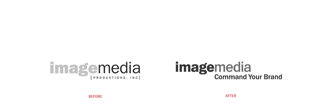
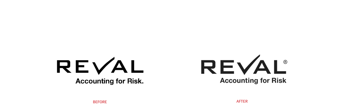
Logo Facelifts
“You look good. Did you lose weight?”
Like some people, corporate logos often need a minor ‘touch-up’ to improve their appearance. Over the years we have worked with a number of clients for whom we have prescribed just such a procedure. Making small changes to a font’s weight, letter spacing, the accuracy of a curve or the length of a descending letter can improve readability, visual balance and reproduction accuracy – especially for digital applications. Most people never notice these detail changes as they are often so subtle that if they were sound only a dog could hear them. Nevertheless, the overall results are noticeable enough and always seem to elicit a reaction comparable to ‘You look good, did you get a haircut?’ Working closely with our go-to type designer Gerard Huerta, we’ve performed such facelifts on the logos shown below.