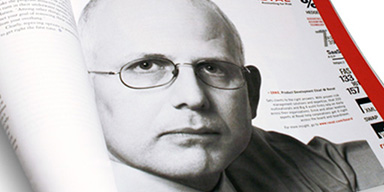
The MacDowell Colony | Brand Identity System
Thinking about the freedom to create.
How did Leonard Bernstein recharge his creative soul? Where could he go to ignite his spark of genius? Does such a place even exist? Well, it does. In a quiet sylvan setting outside Peterborough, New Hampshire there’s a century-old colony created solely to fuel the creative fire of world-class artists. Writers. Painters. Photographers. Playwrights. Architects. And composers like the Maestro.
The MacDowell Colony asked Bernhardt Fudyma to help them commemorate their centennial year – and beyond – by creating a new, energized and contemporary brand identity system that would reflect the colony’s unique character and showcase its artists and their creative output.
SERVICES PROVIDED
Brand Identity System, Marketing Collateral, and Graphic Guidelines
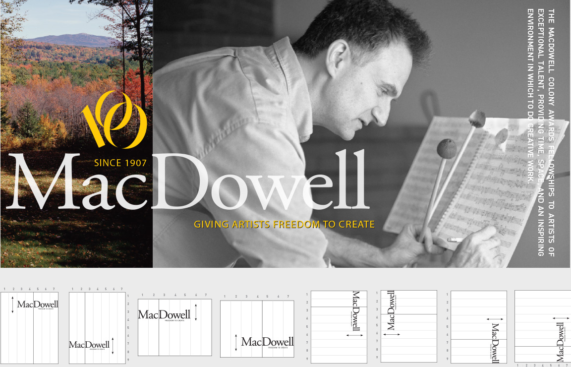
Brand Identity System. Suggesting that the colony’s shortened, popular name become a central visual component of all its communications, we incorporated the MacDowell wordmark into a ‘kinetic’ graphic system which provides ample flexibility to enable numerous layout and orientation options while maintaining overall visual consistency.
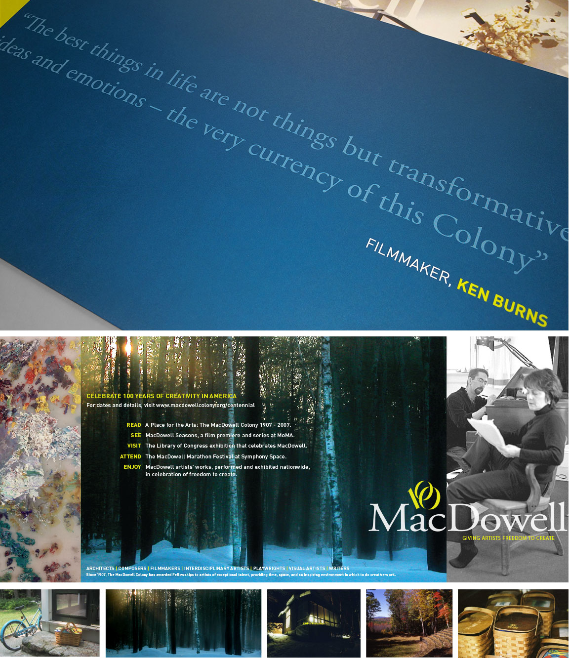
Marketing Collateral. Describing the colony to prospective residents, the press and potential benefactors, required targeted marketing materials for various audiences. Tapping into the wealth of great imagery available, all communications featured scenes of the colony environs, colony artists at work and representations of their creative output.
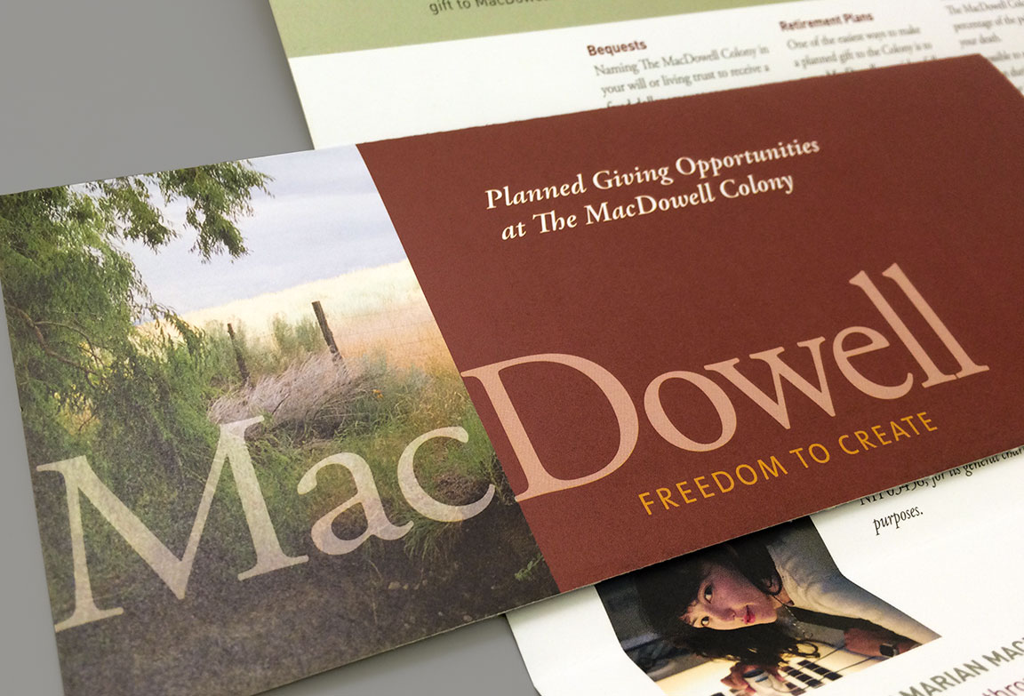
Fundraising Materials. In order to raise funds for expansion, renovation and fellowships, the colony needed case statements, appeals for donations and commemorative gifts for those supporting MacDowell.
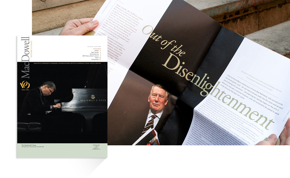
Editorial Design. To energize the impact of their bi-annual newsletter, we redesigned it from a standard 8.5″ x 11″ magazine format to a tabloid size newspaper that enabled more dramatic page layouts and larger images.
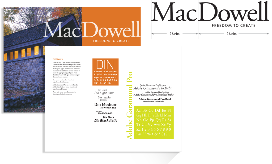
Graphic Guidelines. The ultimate goal was to turn over the design of all Colony communications to their staff who could then direct the creation of future materials more consistently – no matter who produced them. Easy to follow graphic guidelines were created in PDF format to enable electronic distribution or the printing of hard copies as necessary.


